Principles of Let’s Talk

The main principles of Let’s Talk include teaching Children about Puberty and Sex Education in a controlled, safe and interactive manner as well as providing correct information that children and teenagers need in preparation for the changes that their body will go through physically and emotionally.  In order to provide these principles throughout the app, I aimed to create information that was, accessible, engaging, and comfortable to deliver for the parent and child.

A problem that became apparent in my research about how Puberty is being taught in schools was the there is a strong focus on the act of  safe Sex. While this is important in the education of young people this is not the same as the teaching of our bodies.

“Sex education is an important piece of that [puberty], but we must keep in mind a simple fact: that sex happens from the context of a body, but the body exists independently of sex.” (Causbie, 2016)

When we think about where we received the core information about our bodily changes and functions, the majority of the time, it was paired with the topic of safe sex. Teaching children to be more “body literate” will guide them to a clearer understanding of what an adult body is rather than what it can do in relation to sex. Furthermore, it will leave them feeling more confident and more in control of their bodies.

“We should also have body education, teaching young people about their hormones and cycles, well before sex is even in the picture. With a deeper bodily knowledge they can become more responsible, educated, and empowered adults.” Causbie, K. (2016)

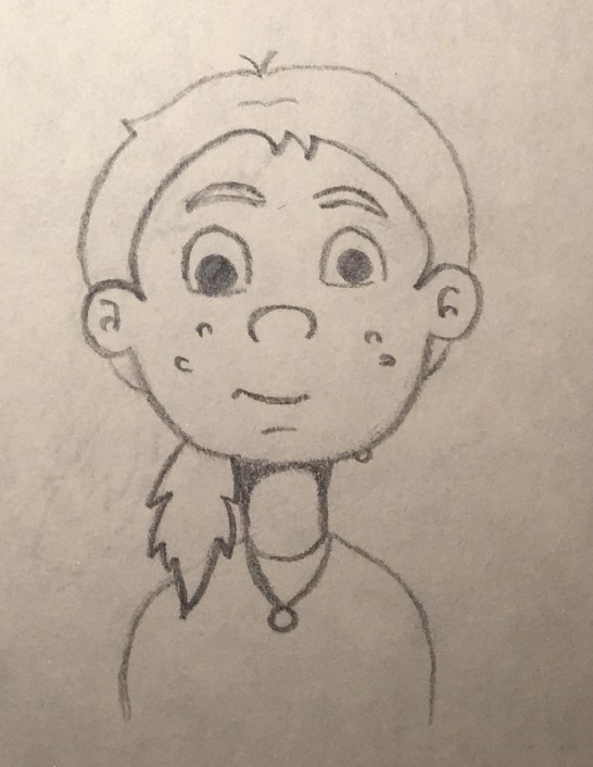
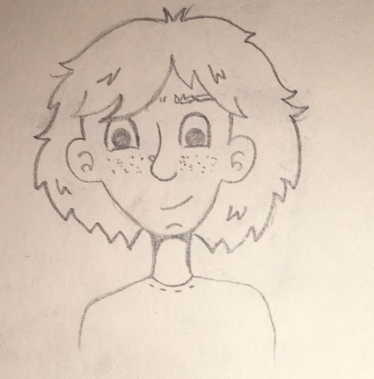
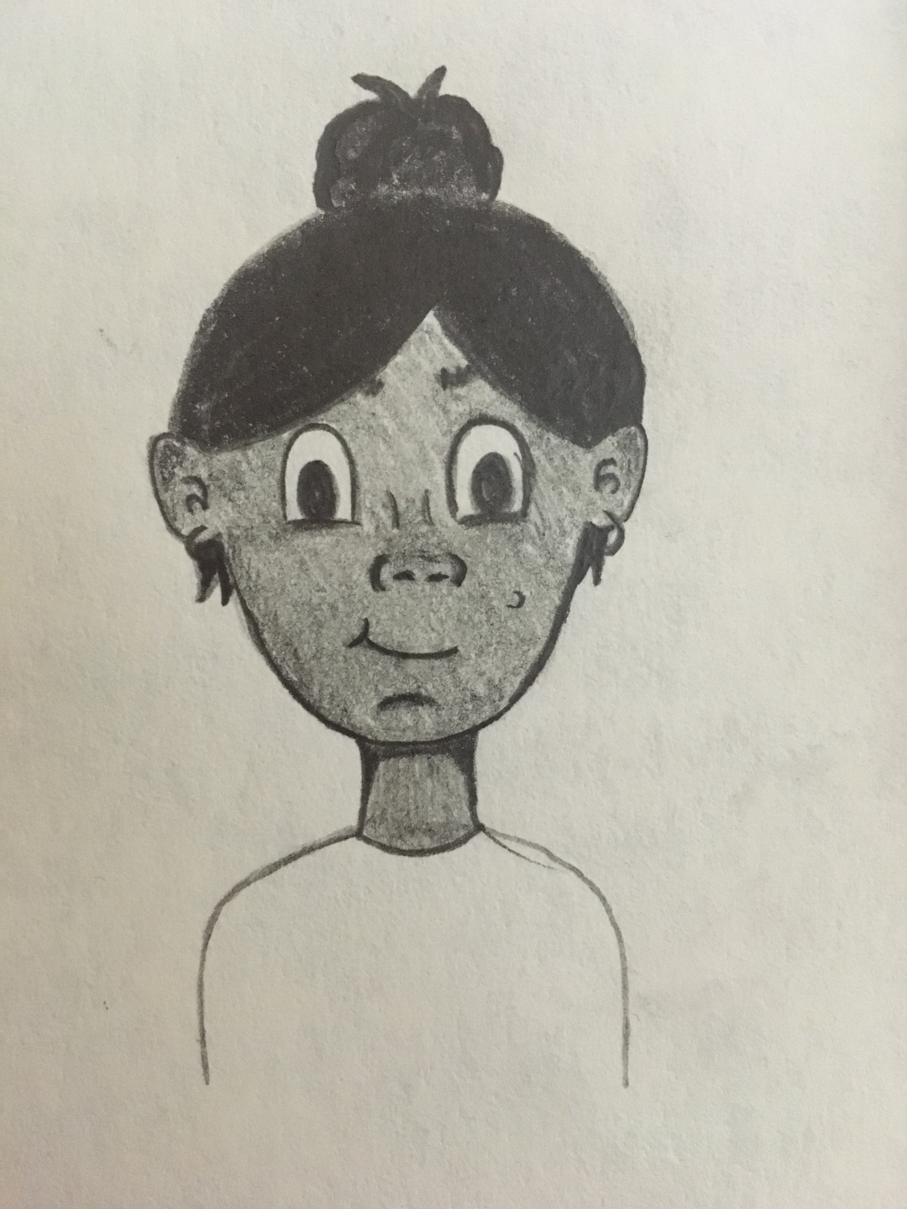
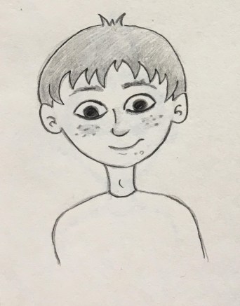
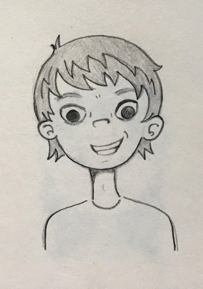
With Body Literacy in mind, the inclusion of body autonomy was a chapter which was an important one to include in Let’s Talk. Ensuring the young users of the app had the knowledge to label parts of their bodies and knew what each part did. By incorporating this into the App, Children can get more out of their education in Puberty. Especially in regards to girls and their menstrual cycles, which can be complicated to understand, and boys dealing with their first erection. Puberty is a difficult time, giving children the information needed about their body, makes the matter less overwhelming and easier to understand.

To create an app that acted as a tool for a safe education in Puberty and Sex Education which is comfortable to deliver, the help and co-operation of parents is needed. Even if a child is taught about sex education at school in informative and high-quality lessons, it’s still a good idea to talk to them about growing up and that Puberty happens to everyone. It’s important that they feel they can talk to a parent and ask questions during such a confusing and challenging time in their lives. – 3

Including a digital PDF manual for parents with the download of Let’s Talk, means parents can be prepared for what the app features and how best to approach the conversation with their child. Some helpful tips suggested by PlannedParentHood.com and ParentInfo.org state that “little and often is best“. Avoid sitting in a formal situation and having one big sex talk. Another tip is to “Listen hard and talk soft“, try not to lecture you child and listen to what they’re trying to say as this lets them open up and feel more comfortable asking for advice. Sex talks need to be engaged and have real communication to work. Remind them that “Different is normal”, tell them it is normal for breasts, penises, nipples, labia, testicles, and clitorises to come in many different shapes, sizes, and colours. This will make them feel less self conscious about their bodies and avoid comparing them to celebrities and other people they see. (Plannedparenthood.org, n.d.)

To ensure the content for Let’s Talk is engaging, the app must feature feedback to the tasks that are required, such as in a game, puzzle or quiz. Giving the child praise for completing a task will motivate them and make them feel joy for doing so.

When sticking closely to these main principles for Let’s Talk which tackle some existing problems in other forms of Education in Puberty and Sex, Let’s Talk will serve a purpose in giving children a safe, interactive and modern education.

IMG_1833.JPG


References

  1. Causbie, K. (2016). The Importance of Body Literacy in Puberty | Kindara Blog. [online] Kindara.com. Available at: https://www.kindara.com/blog/the-importance-of-body-literacy-in-puberty [Accessed 14 Mar. 2019].
  2. Doyle, L. (2018). When to talk to your child about puberty (or will school take care of it)?. [online] ParentInfo. Available at: https://parentinfo.org/article/when-to-talk-to-your-child-about-puberty-or-will-school-take-care-of-it [Accessed 16 Mar. 2019].
  3. Plannedparenthood.org. (n.d.). What should I teach my high school-aged teen about their body?. [online] Available at: https://www.plannedparenthood.org/learn/parents/high-school/what-should-i-teach-my-high-school-aged-teen-about-their-body [Accessed 16 Mar. 2019].

UX Competitor Analysis

DIRECT COMPETITOR (Story Book Formats)

LITTLE STORIES

The tone of the competitor

A happy and fun tone is being portrayed by this particular apps UX design. The use of bright colours and fun characters are helping create this tone. When you click into a story there is music in the background of the story to help set the tone of the particular story you were reading. For example I read a story about a young eagle who is afraid to fly, the music in the background was very calm and inspirational, which fit with the story perfectly and really helped set the tone.

All the graphics in the story were also full of fun characters and bright and lively colours, which will really help in capturing a child’s interest.

Good and bad features

Good features.

Features I really liked on this app, was their use of colour. They used bright and lively colours which really helps set the tone of the app itself, as well and engage a young audience.

I also really like the characters and various illustration designs used in the app itself, moving from story to story you see various styles of illustration, which in my opinion is a great idea as this will help keep the app interesting to children.

There is very little navigation in the app itself which I like, to turn pages you swipe and as well to look through books. You can also choose to go to any page you would like which I thought was an interesting feature of the app.

There is also an option to email the app company with comments within the app, which is only accessible by putting in a code which they ask to put in, this would stop them recieving nonsunual emails from young children, which I thought was a very clever idea.

They also provide you with a preview of each book which contains a short paragraph about the book along with some imagery from the book itself.

Arguably the best feature of this app is the fact that it includes the child in the story, once you enter the gender and name it then puts that name into the story. This is a fantastic feature to keep children interested in the app itself.

Bad features
The main thing I didn’t like about this app was there was a lot of in-app purchasing. They provide you with one book for free, and then if you want any more you must buy them.

I also felt the font itself was a bit small for reading for a child.

As well as swiping to turn the pages there are buttons that can be pressed, but they are almost invisible as they are so unnoticeable.

Another feature I didn’t like was there were a lot of different fonts, there seemed to be no consistent font throughout the app itself.

User Reviews

The app has 4.7 stars out of 5 on the Itunes app store, out of 41 ratings. With the lowest anyone giving the app being 3 stars out of 5.

Wait/load times

The wait and load times of the app were very short. Everything loaded quickly and when you went from page to page or book to book everything appeared quite quickly on screen.

Design

I really liked the overall design of the app itself. I thought there was a good use of colour used, and the way they introduced characters into the app was fantastic and would really appeal to children. Although there were a few navigation issues I came across overall I believe their design was quite successful in what it was trying to achieve, a fun and engaging app for young children. Even the design of each book and the transitions from homepage to book and page to page were all done very successfully. Buttons and Icons as well were all very clear and well designed.

BEDTIME STORY

The tone of the competitor

The tone of the app is a very boring and dull tone in my opinion. The use of very muted colours, little to no imagery and each story is very text heavy. The UX design of this app is very simple, with just a list of stories and when you click into the story you are provided with the audiobook and text of the story. The little graphics that are used seem to be images taken straight from the internet and there is no visual correlation between each story. That is why the design of the app sets a very disengaged tone.

Good and bad features

Good features

A good feature of this app is that there are a lot of stories on the app, you can read or listen to anything from fairytales to educational stories, they are also all free.

It is very easy to navigate through, everything is layed out simply.

The voice overs are very engaging and easy to listen to.

You can also listen to the stories without using the app, which is a great feature.

Bad Features

The UX design of the app is very poor. There is very little colour used throughout the app and it is quite boring to use.

There are a lot of ads in the app also.

Again there seems to be an inconsistent font type used throughout this app also and the font that is used is quite plain and boring.

The stories are very text heavy and I would not suggest using this for a child for reading  as they would not be able for all the text.

User review

The app has no reviews in the Itunes App store.

Wait/load times

There is not a lot of wait or load times, once you choose a story it is almost instantly playing and you can read the text. Going between sections and stories is also quite quick and easy.

Design

In my opinion the design of this particular app is quite poor. From using the app I believe there was a lot more thought put into the content rather than the overall look of the app. It is not unusable and the navigation is quite easy, but again the overall user experience is quite lacking with the overall look of the app being quite boring and lackluster.

Web Apps

As the PhoneGap Developers App isn’t availible on iOS decided and was incompatible with the tablet I had due to it having the wrong version of android OS I decided to buy a new tablet that had the correct version of android. PhoneGap requires version 5.0 and above so I purchased a tablet that uses version 9.0 and the app was still incompatible with my device. I then decided to downlod the adk of PhoneGapDeveloper, which I was able to install and run but it did’t connect to the applications I was attempting to test on my deskop. This was frustrating, but I figured out after some research on message boards about the application that there is a long list of requirements for devices to be compatible with PhoneGap Developer.

API Levels Supported

  • 15+

Hardware Requirements

  • android.hardware.BLUETOOTH
  • android.hardware.CAMERA
  • android.hardware.LOCATION
  • android.hardware.location.GPS
  • android.hardware.location.NETWORK
  • android.hardware.MICROPHONE
  • android.hardware.screen.LANDSCAPE
  • android.hardware.sensor.ACCELEROMETER
  • android.hardware.sensor.COMPASS
  • android.hardware.TOUCHSCREEN
  • android.hardware.WIFI

Permissions Required

  • android.permission.ACCESS_COARSE_LOCATION
  • android.permission.ACCESS_FINE_LOCATION
  • android.permission.ACCESS_GPS
  • android.permission.ACCESS_LOCATION_EXTRA_COMMANDS
  • android.permission.ACCESS_NETWORK_STATE
  • android.permission.ACCESS_WIFI_STATE
  • android.permission.BLUETOOTH
  • android.permission.BLUETOOTH_ADMIN
  • android.permission.CAMERA
  • android.permission.GET_ACCOUNTS
  • android.permission.INTERNET
  • android.permission.MODIFY_AUDIO_SETTINGS
  • android.permission.READ_CONTACTS
  • android.permission.READ_EXTERNAL_STORAGE
  • android.permission.READ_PHONE_STATE
  • android.permission.RECORD_AUDIO
  • android.permission.RECORD_VIDEO
  • android.permission.VIBRATE
  • android.permission.WAKE_LOCK
  • android.permission.WRITE_CONTACTS
  • android.permission.WRITE_EXTERNAL_STORAGE
  • com.google.android.c2dm.permission.RECEIVE  (Pindoria, Suraj 2016)

I brought this issue to my coding lecturer and he suggested I develop the applications as a web application, which is what I would be doing with PhoneGap anyways. I could then test the application on the device using our college webserver (webdevcit.com). I can get javascript plugins that allow me to make the application full screen and allow me interactivity such as swiping (jquery gestures). I can still then transfer the app files into phonegap and export the application from there at the end of the project, I would just be cutting out the middleman during the development phase.

Making Web Applications Fullscreen

There are several easy ways to make a website fullscreen, you can request the browser to go full screen in response to a user gesture, you app download the website to the homepage, or you can auto hide the address bar. ( Making Fullscreen Experiences, 2019)

How I did this

  1. First I created a HTML and CSS file for the homepage
  2. I added this meta tag to the header of the HTML <link rel=”manifest” href=”/manifest.json”>
  3. I then created a JSON file containing this code
  4. I transferred all the files to the server and opened the web page in the browser. I then from the page settings added the website to the homepage
  5. I opened the application from my homescreen
  6. The Website is now Fullscreen

Drag and Drop Touch Events

On a mobile device there is not mouse, touch events must be used instead. There are plugins available for more complex gestures, but this is how I created a simple drag and drop touch event.

  1. Create HTML Element you want to move and give it an id
  2. Create an onload function, store the HTML element in a variable
  3. Add a touchmove event listener to this variable that triggers another function
  4. Prevent the default movements when the event is triggered
  5. Create a variable that stores the new touch location and use this to change the style of the HTML element.

Current Academic Paper

References

Pindoria, Suraj (2016, July 27) Current Software, Hardware, and Permissions Required.[online from comment] message posted to https://github.com/phonegap/phonegap-app-developer/issues/408#issuecomment-235703076

Making Full Screen Experiences, 2019 , Google Developer, viewed 11 March 2019, via https://developers.google.com/web/fundamentals/native-hardware/fullscreen/

Characterisation

To start I wanted to know what was the definition of Characterisation. According to Collinsdictionary.com, characterisation is the way an author or an actor describes or shows what a character is like. Also a description of the character and their traits of their personality. (Collinsdictionary.com, 2019)

The main goal I wanted to achieve with the characters is to have them all have their own personality and look so that we can have a wide range of people represented throughout the Let’s Talk app. The important idea that everyone is unique in their own way. As our app is targeted at children aged 8-12, therefore the characters personalities will have to be relatable to that age range. My aim is to do this by having characters that have strong personality traits that are common among children of that age.

Good character design is one of the cornerstones of good animation. Designing your character properly will make their personalities jump off the screen. Your audience will know who your characters are immediately and like them. When you pair a great design with a great personality, the results can be wonderful. (Maestri, 2006, p3) I keep this idea at the forefront when I was designing the characters for the app.

A huge part of characterisation is the way a character use their facial expressions and the way they move their body. According to UK Essays for animators gesturing parts of the body mainly the features of the head are very important when creating charactisation for their animation. The eyes, nose, mouth and ears are all vital in creating the illusion of human emotion. They say that there is a general rule when it comes to which shapes go with different characters. Such as kind gentle characters usually have soft rounded faces with wide smiles and larger eyes. I think Tweety is a good example of this idea. But for more evil villains usually have more angular features. They might have a sharp chin and smaller eyes with a crooked mouth that show a wicked grin. I think Esma from Emperors new Grove is a good example of this way to represent a villain in animation. This idea for characterisation can act as a visual shorthand for the viewer. They can optimise the impact of the character by the way they look and how they express their emotions. This helps the viewer to make connections and process the narrative about the characters easier. (UKEssays.com, 2018)

Another vital part when designing the characters was showcasing different ethnicities to make sure the characters were culturally diverse. From watching animations myself the use of different ethnicities is starting to take off with movies such as Moana and Coco. I wanted to reflect this new way of repenting all kinds of people throughout our Let’s Talk app. As puberty is a topic that effects everyone as the grow up, the idea of using a view range of characters was fundamental. Within the world of animation in the past the majority of Disney princes and princesses have been white and thin. Disney animator John Lasseter has been extremely critical about this and is trying to change this way in creative direction. He has said that “It’s very important to us to have female and ethnic characters” (Bell, 2015). So when I am designing the characters for the app I will be conscious about including a wide range of different cultures and races.  

Another fundamental aspect of our character design was drawing different body shapes for boys and girls. I felt this was an important step when drawing the characters. Having a range of body types represented is a huge factor when showing  that the characters were individuals. 

When deciding on what style I wanted for our character I looked at other characters with a similar aesthetic that I wanted to emulate through my design. Looking at animated shows such as “The Proud Family”, “Daria” and “Sabrina, the Animated Series”, they all had teenage characters and I took notes on how they were designed. When designing our range of  characters creating their appeal was one of the main challenges. Having a realistic look by drawing them with imperfect skin and different body shapes was very important. I wanted to draw the characters with unique features such as big noses, spotty skin and messy hair. I also giving them their own personal style and personality which would add to their overall appeal.


Drawing the Characters

A helpful tip I got from George Maestri book was, as you design, you do need to keep technical considerations in mind. The technical limitations can affect the design and forces it to stay simple. Use the strong points of your software to your advantage, and design around you limitations. (Maestri, 2006, p7) When drawing the characters I kept this in mind. As I would be using Illustrator, Character Animate and After Effects how I drew the characters in a way that all their features where on different layers. After designing 12 male and 12 female characters, I began to give each names and their own personality traits. When choosing names for the characters I thought about their nationality and their personalities. I researched what names were culturally correct to each character. I also used some unisex names. I wanted their names to be inclusive just like their design.

Final designs

Boy_Sketches.jpg

girls.jpg

Character Profiles

Name: Lucy

Traits: Sociable, Cheerful, Questioning

Charcter1female

Name: Aki

Traits: Silly, Outgoing, Active

23.jpg

Name: Sam

Traits: Independant, Hardworking, Shy

24.jpg

Name: Pari

Traits: Charismatic, Generous, Impatient

5.jpg

Name: Roisin

Traits: Kind, Loyal, Friendly

15.jpg

Name: Olivia

Traits: Sporty, Logical, Competitive

16.jpg

Name: Mia

Traits: Caring, Lyrical, Self conscious

17.jpg

Name: Jamie

Traits: Observant, Creative, Quite

18.jpg

Name: Riley

Traits:  Adventurous, Humorous, Impulsive

20.jpg

Name: Sara

Traits: Dedicated, Curious, Clumsy

21.jpg

Name: Yu Yun 语嫣

Traits: Imaginative, Crafty, Gullible

22.jpg

Name: Emily

Traits: Neat, Organised, Controlling

IMG_3823

Name: Noah

Traits: Charismatic, Curious, Demanding

IMG_3807

Name: Jack

Traits: Energetic, Honest, Sarcastic

13.jpg

Name: Haruto

Traits: Friendly, Patient, Forgetful

14

Name: Lucas

Traits: Innovative, Freethinking, Gloomy

img_3808.jpg

Name: Ben

Traits: Funny, Confident, Lazy

Character3.jpg

Name: Min-Jun

Traits: Sociable, Mischievous, Witty

10.jpg

Name: Sean

Traits: Lazy, Playful, Relaxed

11.jpg

Name: Max

Traits: Trusting, Genuine, Reserved

12.jpg

Name: Charlie

Traits: Quirky, Dependant, Selfless

character4.jpg

Name: Travis

Traits:  Sensitive, Kind, Curious

7.jpg

Name: Dylan

Traits: Spontaneous, Colourful, Stubborn

punk.jpg

Name: Li Wei

Traits: Fearless, reactive, impulsive

9.jpg


Voice acting

Having good voice acting is another way to add to the characterisation of a character. “A good script and voice performance will help your character appear real and will make their personalities pop off the screen” (Maestri, 2006, p276)

Characters characteristics and qualities are defined by a persons personality. It is also important how they use their voice. Whether the character is an introvert or extrovert arguably their voice can have a big impact on how they engage in conversation and the types of dialogue they choose to build. Their personally traits play a major role in defining their voice. So take time when deciding their personality. (Kieffer, 2018)

From my own knowledge characters with a distinctive voice adds to their personality. For example Squidward from the show Spongebob Square Pants has a dull drawn out voice which highlights his personality traits such as gloomy, depressed and annoyed. Another character is Mickey Mouse his hi pitch voice compliments his happy personality traits.

UnknownUnknownm

So when deciding what voice actors to use within the Let’s Talk app keeping this idea in the forefront of my mind will help to chose the correct voice for each character.

References

Bell, C. (2015). Here’s How Animation Is Paving The Way For A More Diverse Hollywood. [online] MTV News. Available at: http://www.mtv.com/news/2244276/animation-diversity-hollywood/ [Accessed 26 Feb. 2019].

Collinsdictionary.com. (2019). Characterization definition and meaning | Collins English Dictionary. [online] Available at: https://www.collinsdictionary.com/dictionary/english/characterization [Accessed 27 Feb. 2019].

Kieffer, K. (2018). How to define your characters unique voice. [Blog] Well-storied. Available at: https://www.well-storied.com/blog/how-to-define-your-characters-unique-voice [Accessed 6 Mar. 2019].

Maestri, G. (2006). Digital character animation 3. Berkeley, Calif.: New Riders, p.3. p.7 p.276

UKEssays.com. (2018). Characterisation in 2D Animations. [online] Available at: https://www.ukessays.com/essays/animation/characterisation-in-2d-animation.php#citethis [Accessed 26 Feb. 2019].


Colour Theory

“Color theory encompasses a multitude of definitions, concepts and design applications – enough to fill several encyclopedias. However, there are three basic categories of color theory that are logical and useful : The color wheel, color harmony, and the context of how colors are used.”(Morton, n.d.)

Color theory is an important aspect when developing a user interface (UI) and creating a visual identity. Color theory refers to how colors logically work together, to create a story that both inspires enthusiasm and appeal in a user or viewer. Color is the most important aspect in design, it has the ability to set the tone of the design and evoke an emotional reaction from the user or viewer.  “Choosing the right colors and knowing why certain colors work and others do not can determine whether or not our design will work. Poor color choice can make our site difficult to use, or our text impossible to read and the user will leave our website.” (Trythall, 2015)

THE COLOR WHEEL

“A color wheel (also referred to as a color circle) is a visual representation of colors arranged according to their chromatic relationship. Begin a color wheel by positioning primary hues equidistant from one another, then create a bridge between primaries using secondary and tertiary colors.” (Worqx, n.d.)

The Primary colors are red, yellow and blue, all other colors are derived from these three colours. These three colours cannot be created from other colours.

The secondary colours are green, orange and purple and are created by mixing the primary colours.

The tertiary colors are yellow-orange, red-orange, red-purple, blue-purple, blue-green and yellow-green. These colors are created by mixing a primary and secondary colour. Depending on the primary colour that is used the hue of the tertiary colour could be different, hence the double barreled name.

COLOR HARMONY

“Harmony can be defined as a pleasing arrangement of parts, whether it be music, poetry, color, or even an ice cream sundae.” (Morton, n.d.)
When choosing a color palette it is vital to choose colors that work well together, you want to create a visual that is pleasing and exciting to look at, and choosing the correct colour pallete is an important step in this process. If you cannot create a harmonious color palette that can have a detrimental effect on your design as you are not only disengaging the viewer or user, but you will create a boring or chaotic visual.  Creating a chaotic visual will disencourage a user or viewer, as a busy visual will not allow for concentration. When developing a color pallette it is important to develop a color story that falls between busy and boring, as opposed to under stimulating or over stimulating a viewer.

COLOR FORMULAS

Analogous colors – these are any three colours that are side by side on the colour wheel. Usually on colour predominates.

Complementary colors – these are any two colors that are directly opposite each other on the colour wheel. These colours create a contrast and stability.

Nature – these are pre existing color schemes in which you can find in nature.

COLOR CONTEXT

Color context refers to how colors work in relation to other colors and shapes and is a complex factor when discussing color theory. Depending on the other colors used in a design colors can appear differently despite being the exact same.

“The relationship of values, saturations and the warmth or coolness of respective hues can cause noticeable differences in our perception of color.” (Morton, n.d.)

COLORS FOR KIDS

When developing a colour story for children it is vital you choose a bright and vibrant colour palette, more is more when in relation to design for children. You want to grab their attention and stimulate their minds to keep them attentive. Red, blue, yellow, green, purple and orange are all considered happy colours and are a popular choice when choosing a colour palette for children, as you can include all these colours and more in your design. When designing for kids you can have fun and break a few rules as it is all about stimulating and keeping their attention. Using lively and vivacious colours will allow for this.

It is important to portray a happy feeling as that is what kids want when using an app or website. So using bright and happy colours will help you achieve this feeling of joy and allow you to create a bold and bright world for children to explore.

LET’S TALK

When developing a colour pallette for “Let’s Talk” it was important to choose colours that not only worked well together but portrayed a positive feeling. Being conscious of the sensitivity around the applications content, it was important to choose colours that evoked a positive emotion, as the aim of the project is to shed any preconceived notions surrounding sexual health and dispel any taboo associated with the topic. Choosing bright and lively colours will create a bright and open world for the children to explore as they are educated on their transition from childhood to adulthood.

These colours were chosen as they work harmoniously together. As the application is intended to be used by all genders it was important to choose a colour palette that is gender neutral. The use of these bright colours will allow for engagement with the application, with the ability to retain a child’s attention.

REFERENCES

Morton Jill, (n.d.) Basic Color Theory, accessed 08/03/2019 via

<  https://www.colormatters.com/color-and-design/basic-color-theory >

Trythall Joni (2015) Web Design for Kids : Color, accessed 08/03/2019 via

< https://webdesign.tutsplus.com/tutorials/web-design-for-kids-color–cms-24378 >

Worqx, (n.d.) Color Wheel, accessed 08/03/2019 via

<http://www.worqx.com/color/color_wheel.htm>

Sex Education Books for Kids

Books are considered the main competitor to the Let’s Talk app. There are numerous books on the market which give children an understanding of Puberty and Sex education. I want to review a number of them and speak about how they managed to stand out at being some the best. Analysing these books should give us an insight into how to tackle these topics in our app and what the professionals are doing to engage children into learning about Sex education.

Many parents use books as a way of introducing their child to sex as it is a helpful way to start the conversation, that may be an awkward topic for some. Using a book which provides the words/script/context is a great place to start as it eases off the pressure to have to know everything as a parent. They also provide some great age-appropriate content or words to use. And It is known that there are some amazing benefits to reading aloud with your child. (Hakanson, 2019)

22889878

The first book I want to look at is “Sex is a Funny Word”  by Cory Silverberg. This book is described as a comic book for kids that includes children and families of all makeups, orientations, and gender identities, Sex Is a Funny Word is an essential resource about bodies, gender, and sexuality for children ages 8 to 10 as well as their parents and caregivers. The book features four relatable kids who take the reader through all the topics covered in the book with humor and a little bit of sass. The book begins with an introduction of each of the characters with some quirky facts about them such as their favourite food, their likes and dislikes, The diversity of the characters in the book is something that sets this particular book apart from the others. This is an aspect Let’s Talk will focus heavily on also.

The comic is thought to be the new and reimagined “sex talk” for the twenty first century. The book is a great opportunity for adults to convey their values and beliefs to their children while providing information about boundaries, safety, and joy at the same  time (Silverberg, C. and Smyth, F, 2016). While doing my research of this book and what people liked about it, I found that a key factor to the success of “sex is a funny word” is the balance of information. Puberty and Sex is a heavy topic with heaps of information.

Screen Shot 2019-03-03 at 22.09.24.png
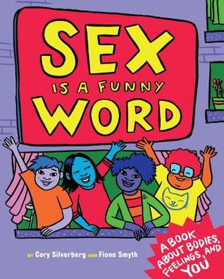
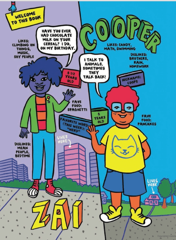
It can be a lot for even adults to wrap their head around. However, Silverberg achieves to provide the right amount of information without overloading a large amount of technical and complicated biology. With regards to the illustration, the illustrations of genitalia are cartoony, but extremely thorough enough to show the diversity of what our parts look like and what they can do without shame or judgment.

Each page of the comic is so enticing and engaging and as a child, these types of illustrations are usually fun to look at. There are elements of interaction with the reader too, such as asking questions at the end of each chapter which encourages the reader to answer or talk to a person they trust about their answers. This is a wonderful way to keep the child interested as they are reading.

Screen Shot 2019-03-03 at 22.15.47.png


Another book which has had great success is a book by Pediatrician Dr. Cara Natterson.

Image result for guy stuff the body book for boysThe book entitled “Guy Stuff – the body book for boys” tells boys about the physical and emotional challenges of puberty and adolescence. (Natterson, 2017) Natterson has written previous books on what Girls experience during puberty but has decided to create a book that boys can call their own as she believes there is a lack of information for boys out there in comparison to girls. She says  “Boys have very little information in the print world. Our social conversation about puberty has been largely directed at girls,” Natterson said in an interview. “We are really good at talking to girls about puberty and body changes and social changes and emotional changes, but we are really bad as a society [at] talking to boys about it.” (Italie, 2017)


The aim for these books is to open up conversations with children and an adult they trust before puberty.

Related image
The correct information is easily accessible and we must use that in a safe way for children to feel comfortable and confident about the topic. This is also the aim for Let’s Talk but in a digital format, which is a new and fun way for children to learn. 

The book features quirky, savvy illustrations that include the facts for Boys during Puberty, from hair care to healthy eating, bad breath to shaving, acne to voice changes, and everything in between. The information is not overwhelming to a child’s point of view and is condensed into clear manner with language that is quite “tongue and cheek”.

As well as tackling all of the physical changes that are happening, the book also deals with the many emotions boys experience, with a chapter on moods and how to manage them once boys hit puberty. Moodiness is broken down into two general categories — quiet and withdrawn, or angry, impulsive or aggressive — However, in the book it is important and made clear that not all guys may experience puberty in that way and that all boys are different. This is a major factor in writing content for Puberty, I have learned. You never want to make the child reading, feel alone or insecure about the way the are. Getting the message across that no 2 people are the same is the goal when teaching young children about sex education. 

The Care and Keeping of You is another series of books by the same publisher as Guy Stuff – the body book for boys. These books however are directed towards girls and are split in to 2 volumes – one for younger girls and one for older girls.

Image result for the care and keeping of you                             Image result for the care and keeping of you

Author Valorie Lee Schaefer walks girls through the basics of puberty, including how girls’ bodies change, how to choose a bra, and what menstruation is and how to manage it. It also discusses basic self-care from good sleep habits to exercise and nutrition, and discusses issues surrounding body image. Illustrations depict breast development and how to use sanitary pads.(Schaefer, Natterson and Masse, 2012)

Image result for the care and keeping of you

Schaefer wrote the text in a deliberate, reassuring tone, one she called the “trusted, cool aunt.” “It wasn’t your mom or dad’s older sister,” Schaefer says. “It was probably their younger sister, someone with a few years under her belt, but also someone who wasn’t so out of touch with her adolescence that she couldn’t remember what a confusing time that was.” (Pohle, 2019)

 The tone in which the information is delivered to the child is such an important factor in ensuring the attention of the child is present and the text isn’t boring or too complicated for them to understand.  Many books on this topic can have a “clinical” approach which is good in regards to the factual side on things, but not so much for the tone and how it is delivered. The book is described as a good balance between chatty and serious in an approachable way.

After thoroughly researching the books available for parents to help teach their children about Puberty and Sex, It has given me a beneficial insight to how illustrators and authors use the information and artwork in a clever and engaging way. This is something the Let’s Talk app will focus on to achieve the best approach to talking about the many stages involved in growing up. 


References –

How to design characters

For the Let’s Talk app we knew we wanted to implement animated scenarios. With this idea designing appealing and relatable characters was key. Our goal with the characters was thorough their design and animations that it would form a connection with the viewer and encourage them to become engaged with the topic of puberty. Having the characters discus their experiences during puberty within different scenarios will help show their humanity.

How to design and create a character

The starting point when creating a character is the design. “The creation of convincing characters is fundamental to the success of a visual narrative.” (Salisbury, 2004) Bringing the character to life is very important when designing. Design is all about making choices through your artist and technical side, the combination of both can lead to a well thought out character. But before you can start the technical side which includes illustrating, texturing and rigging. You have to design it carefully. Getting to know your characters personality and then making choices on how to communicate this visually. When designing the character making decisions about their size, shape, texture, colour and clothing is important. Then combining this with the technical side, because well designed characters are easy to animate and this makes the animators job better and more creative. Good character design is vital when it comes to good animation. (Maestri, 2006)

According to George Maestri “First and foremost, a well-designed character coveys personality. Your character should also be well-proportioned and appealing to the eye. In addition to your character’s outward appearance, you also need to design with animation in mind, understanding your software and what it needs to animate a character successfully” (Maestri, 1996) As I will be using Adobe Character Animator  and After Effects as the technical software to create my animations, I will keep this advice in mind as each software requires a different method of drawing my characters in order to animate them successfully. “Simplicity is the key to designing good characters. Many times, the most amazing characters turns out to be the simplest to construct.” (Maestri, 1996) My character design will be simple which will be a great benefit when I start illustrating and animating them. I will be creating flat vectors of my characters with limited parts as it will help with keeping track of them when animating, also it will be less likely to slow own my laptop when working.

For the app as the characters are human having a realistic design is essential. Understanding anatomy is really important when drawing a human. Knowing the basic structure of the human skeleton is needed to know how your character should move in a realistic way. (Maestri, 1996)

human_skeleton

Designing realistic characters

Head and Body Proportions: The most important is the ratio of the head to the body. The average human height is seven to eight heads tall, making a character taller than this can make them look more powerful like a superhero.

Face: It is the centre of the character, a good design will immediately show the viewer who the character is and what they are feeling. Faces can be a variety of shapes and sizes.

Eyes: The eyes of the character will give the viewer a lot of information. Eyes are very important and most designers will make them larger so they can be seen more clearly. The size of the eyes in relation to the face can also give clues to the characters personality. Mostly bigger eyes are cuter, more childlike where as smaller eyes can indicate a villain. Eyes express emotion through the lids making them more narrow or wide changes the eye shape. Using the lids different expressions can be conveyed.

Brows: Brows work together with the eyes to convey emotions. Raised eyebrows might show that the character is surprised and by lowering them can convey anger. Using good brow emotion is important and the design will affect the way they will work.

Mouths: They are highly expressive and come in a huge variety of shapes, so designing them correctly is important. Using replaceable mouths for animation can be used to give a stop motion feel. Expressing different emotions with the mouth is effective as it adds to the overall expression.

Hands: Apart from the face, hands are a very expressive part of the body. Many characters use their hands to express gestures. Well designing hands allow the character to express themselves more clearly. You can slightly oversize the hands for a cartoony look. If the design is realistic keep the proportion of the hands realistic too. The main challenge with hands is connecting the hand and arm. As it is a very flexible joint attaching the two can be tricky. To help with this using a wristband or long sleeve shirt can hide the seam, which allows you to create the hand separately and avoid a technical issue.

Feet: On a human character, feet are small in relation to the body. The feet should be as long as the characters forearm. When animating drawing the foot inside the shoe isn’t needed just having the shoe attached to the leg at the ankles is fine.

Clothing and other accessories: Clothing tells the viewer a lot about your character, like who the character is and how they should be perceived. When designing characters and their clothing be original and avoid stereotypes where possible.

(Maestri, 2006)

Finalising Your Design

The first step in finalising your characters design is to sketch them onto paper. Keeping in mind the software you will use as this affects the way you draw the character because it will have to be drawn in a certain way to work within your choice of software. Drawing the character in specific poses is needed. You will need a front and side view. Draw the character with their arms outstretched in the front view this will help with rigging later. (Maestri, 2006)

Tips on designing a character

1.Who is your character for: Your audience is key to how you will design the character. For example designing for young children would usually include the use of basic shapes and bright colours.

2.Where will the character appear: Where will the design be seen and what medium. This will affect the design because if the character will be used for a phone having a simple design would look better instead of having a lot of detail.

3.Reaserching other designs: This can be helpful when identifying what works and what doesn’t. Studying other illustrated/animated characters from tv, books, film etc, can be a benefit to see how they are successful and what people like about the design.

4.Making the characters distinctive: The characters you design must be visually strong and interesting to get the viewers attention.

5.Keeping your design simple: Having a simple design helps when rendering your animation and it allows you to convey necessary information that you want the viewer to see.

(Staff and Arts, 2019)

Taking notes on other animation styles

I started with researching other characters with a similar aesthetic that I wanted to emulate through my design. Looking at animated shows such as “The Proud Family”, “Daria” and “Sabrina, the Animated Series”, they all had teenage characters and taking notes of how they were designed. 

1*TWNyQZ2TJ8f-ISBKlVyxYw

banner_1476Daria_1412976756283

I like that they all had their own style. They had a realistic look of drawing the characters with imperfect skin and different body shapes.  The characters have unique features such as big noses, spotty skin and messy hair. I also like that they had their own personal style and personality to add to their appeal. I took note of this when designing the characters for the animated scenarios. 

References

Maestri, G. (2006). Digital character animation 3. Berkeley, Calif.: New Riders, p.3, p11, p12, p13, p14, p16, p18. [Accessed 1 March 2019]

Maestri, G. (1996). [Digital] character animation. Indianapolis: New Riders, p.10, p13 [Accessed 1 March 2019]

Salisbury, M. (2004). Illustrating children’s books. London: A&C Black Publishers, p.62. [Accessed 2 March 2019]

Staff, C. and Arts, C. (2019). 25 top character design tips. [online] Creative Bloq. Available at: https://www.creativebloq.com/character-design/tips-5132643 [Accessed 2 Mar. 2019].

Phone Gap – Features and Functionality Notes

In my last post I detailed the process I went through to come to a decision on what method I would use to develop our application ( post here ). I came to the conclusion that using PhoneGap would be the best fit for our particular project.

So, what is PhoneGap ?

“PhoneGap is an application framework that enables you to build native applications using HTML and JavaScript. Think of PhoneGap as a webview container that is 100% width and 100% height, with a JavaScript programming interface that allows you to access operating system features.” (Natili, Giorgio 2013).

In essence PhoneGap allows you to use web development languages HTML, CSS and JavaScript, to develop and test mobile applications for both Android and iOS. PhoneGap is “an open source, cross-platform framework for developing mobile applications. PhoneGap allows developers to leverage web development skills— HTML, CSS, and JavaScript— to developed native applications for iOS, Android, BlackBerry, and many other platforms with a single codebase.” ( Lunny, Andrew 2011)

What kind of Applications can you create using PhoneGap ?

There are three main types of applications available, native apps, web apps and hybrid apps. There are advantages and disadvantages to each method of application development. Native apps are made specifically for the OS they are intended for. Native applications can store more data offline and have more access to the devices hardware and OS features. These apps are more costly because they have to be coded in the language corresponding to each specific platform.

Web Apps can be developed using one common language for all platforms, however they have limited functionality and access to the devices OS. “Web apps are built using web standards, so it’s possible to have a common code base for all the supported devices and it’s much easier to find developers with the appropriate skills. On the con side, a web app is not able to access the entire device’s hardware and OS features and is not installed on the user device, which means that users cannot access it when the device is not online.”(Natili, Giorgio 2013).

Hybrid applications are a mixture of web apps and native applications. “A hybrid app can be viewed like a web app on steroids; in fact it uses web standards and can access most of the device’s hardware and OS features”(Natili, Giorgio 2013).

Beginning in PhoneGap

Using PhoneGap it is possible to build the core functionality of the application testing on a desktop browser before moving onto a native project. You can also use the PhoneGap developers application to test your application on the actual device (this is only currently available for android development as the application was recently removed from the app store).To begin a project you simply open up the PhoneGap desktop application and start a new blank document. You are required to place the new application into a folder and name it. It is also recommended you give the application an ID in the form of a backwards URL.

Scaling UI images based on Pixel Density

  1. Create a css class for the images you wish to scale <img class=’highres’ />
  2. Create a script able to get all the images marked with the previously defined class and change their width according to the pixel ratio. function processImages() { var pixelRatio = window.devicePixelRatio; if(window.devicePixelRatio > 1) {   var matches = document.querySelectorAll(“img.highRes”); for(var i = 0; i < matches.length; i++) { matches[i].width = (matches[i].width / pixelRatio); } }
  3. Run the script when the page is loaded or when the deviceready event is fired. When using PhoneGap, it is strongly recommended that the code that needs to run at startup is executed immediately after the deviceready event.

addEventListener(‘deviceready’, onDeviceReady);

function onDeviceReady(evt){ processImages(); }

(Natili, Giorgio 2013)

Page 186 of PhoneGap Beginner’s Guide by Giorgio Natili has a list of all the common API plugins available.

Accessing Device Sensors

“The use of sensors opens the doors to sophisticated apps, able to improve the user experience and enhance the capabilities of a modern app” ( Natili, Giorgio 2013) Most mobile devices have sensors that sense touch, geolocation, orientation and motion. These sensors are generally composed of an accelerometer, gyroscope, compass, barometer, and orientation sensor. understanding how these sensors work is an important step o understanding how to use them.

Accelerometer : Generally made up of three accelerometers, one on each axis (x, y, z), that measure the changes in velocity

Gyroscope : Measures the rate of rotation around the axes pitch, roll and yaw.(y, x, z).

Magnetometer : Measures the strength of magnetic fields around the device, this is how the phone determines its position in relation to the geomagnetic north pole.

Location Capabilities

Determined by position sensors

  • GPS
  • APS
  • Cell Tower Triangulation
  • Wifi Triangulation
  • IP Address

Orientation Changes

Device User GestureEvents FiredOrientation
Ipad to Landscaperesize0
orientation90
Ipad to Portraitresize90
orientation0
Android to Landscaperesize 90
orientation90
Android to Portraitresize0
orientation0

Current Academic Paper

Bibliography

Natili, G 2013, PhoneGap Beginner’s Guide, Packt Publishing Ltd, Birmingham. Available from: ProQuest Ebook Central. [1 March 2019].

Lunny, Andrew. PhoneGap Beginner’s Guide, Packt Publishing Ltd, 2011. Available from: ProQuest Ebook Central. [1 March 2019].

Developing a Storyline

When researching storyline development I read an article of the 9 steps to develop an effective storyline for a children’s book. The article was written by Eevi Jones, an award winning and 7 times best-selling children’s books author, it is a very comprehensive article and I have decided to follow the 9 steps she outlines in this post as a way to help us begin to develop an effective storyline for our application (Jones, 2019)

Step 1 – Choose a Format

This step requires you to consider whether you will publish and ebook or a paper book. As we are making an appilcation, our story will exist in a digital space anyways therefore this step doesn’t specifically apply to our project

Step 2 – Write a book for Children, not for Adults

This step is more of an important reminder that although children won’t be the people purchasing the book, it is important that the story is enaging and interesting for them.

Step 3 – Narrow Down your Book Category

CategoryAgeWord CountPagesIllustrations
Picture Book0-3032Every Page
Young Picture Book2-5200-40032Every Page
Trade Picture Book4-8400-80032+Every Page
Picture Story Book6-101,000-3,00032+Every Page
Chapter Book6-103,000-10,00032+Almost Every Page
Middle Grade Book8-1215,000-40,0008212+ Illustrations

(1) Chart describing Book Categories

We are aiming the book towards 8-12 year olds, because this is the age within which children begin to go through puberty. Our story will be in the form of an interative application which means it will rely on both animations and text to convey the storyline. Nonetheless the story will need to be reasonably complex to address all the issues within the topic. Each chapter will address a certain topic and there will be a mini informational story within each chapter.

Step 4 – Really get to know you Target Audience

  1. The Children who will consume your book
  2. The Grown ups who will purchase your book : main buyers are aged 33-40 , 70% female (1)

Spend time with the age group

Talk to parents and teachers

Give a survey to women and men in targeted category

Study Books in your targeted age group

  1. General Layout
  2. Vocabulary Used
  3. Bookstore or Library
  4. Age Group/ Consumer Trends
  5. Census/Demographic Details

Step 5 : Choose a writing Style

  1. Past/Present Tense?
  2. First of Third Person ?

Step 6 : Important Elements to Remember

  1. Unforgettable Characters
  2. Suspense/Action
  3. Realistic Dialogue
  4. Storyline
  5. Instant Recall Factor

Step 7 : Title

Our current working title for the whole project is Let’s Talk. We aim to stick with this title because we think it is appropriate for the message we are trying  to communicate. We wish to approach the topics of puberty and sex in an age appropriate, open and honest way that encourages children to talk about them openly with their parents and friends about sex.

Step 8 : Editor 

Considering there are four of us working on the project I don’t think it will be necessary for us to hire an editor becuase we can always proof read eachothers work and will all be on the look-out for correct spelling and grammer in eachother’s work.

Step 9 : Illustrations

It is recommended in the article that we structure the illustrations horizontally as this is best for a journey like story. This also suits us well as we will be creating for a mobile device such as a tablet it makes more sense usability wise to design for a horizontal screen. We will need to create a storyboard once we have completed the storyline and decide what animations/interactions will be done as part of each story.

Let’s Talk

Some important things to remember when writing the script for Let’s talk is that it must have a balance of being ethically appropriate while being suitable for younger and older children between the ages 8-14. These factor will come into play especially when narrating the storyline. The pitch and tone of the voice must be appealing for the children using the app, keeping them engaged. Some parts of the app may need to have a hint of a lulled tone to ensure a sense of seriousness to the content on screen. 


References


Designing UX for kids

“User interface (UI) design is the process of making interfaces in software or computerized devices with a focus on looks or style. Designers aim to create designs users will find easy to use and pleasurable.” (Interaction Design Foundation, n.d.)

When developing a User Interface (UI) it is important to utilize predictability, such as, a home button brings you to the home page. Creating a simple and sleek interface allows for an invisible feel for a user, every element must play a purpose. Which in turn, minimises the amount of tasks for a user to complete, which is in an important aspect of UI, creating a navigation that allows a user to get from point A to point B in as swiftly as possible. Assessment is a vital aspect of UI, offering feedback throughout to the user. Recurring design patterns throughout allow the user to become familiar with the interface, which enhances usability of the UI.

It is important to first identify the methods and rationale when developing a UI for children, as the target market for “Let’s Talk” is children aged between the ages of 8-13. Although the same outcome is expected from all UI design, it is vital to outline the key differences when approaching a UI for a certain age group, in this instance, children.

Initially I decided it was important to research creating a navigation for children. The navigation must be straightforward, it is important to develop a navigation that is coherent for children. Utilizing predictability when developing a UI for children is essential, buttons must also be large and distinct, 2cm by 2cm is the suggested dimensions. As “Children’s motor skills are still developing” (Drimteam, n.d.)  gestures that support their current knowledge of modern IT is suggested. Actions like swiping, tapping and dragging should be emphasised when developing interactions, as these movements are familiar and obvious for a younger user. Big arm and hand gestures are better developed during childhood. Tapping and swiping when interacting with the application is a strong approach when supporting a child’s motor skills. Easing interactions and minimising the navigation is another method when developing an engaging and enjoyable UI for children

Offering feedback and conducting assessments throughout the application is a vital aspect when developing an engaging UI for children. “Youngsters love being congratulated for their accomplishments, especially by characters that they can identify with. Humour them!” (Drimteam, n.d.). Utilizing praise in the application will instill both excitement and confidence in the user, which in turn will encourage the user, allowing them to ultimately grasp such a sensitive topic such as puberty. Educational applications are educating children in innovative ways, which were previously unimaginable.

It is important to consider that children have a lower attention span when creating a UI that both excites and engages them. The use of progression bars, and a fast load time when navigating through the application are beneficial. Kids are curious and will not necessarily use the app as intended, another detail which must be considered. Precautions must be in place to ensure that when a child does decide to stray away from the set navigation that the applications is still usable and any unpredictable steps taken will not take away from the set navigation and are easily corrected.

It is vital to design for a specific age range when developing a UI for children. There are vast differences in the capabilities of children which are just a few years apart. As well as their abilities, there is a sharp contrast between their interests, especially in relation to technology. Considering this, it important to design for a specific age range as it is rare that you will have the ability to design and interface that will appeal to children across all ages. When developing the UI for “Let’s Talk” it will be important to create an interface that appeals to children between the ages of 8 and 13.

In conclusion when developing a UI for children, it is important to take their physical ability, existing knowledge and motor skills, and most importantly their age into consideration. Creating a UI that exceeds a child’s knowledge and skills will discourage the user, which will result in a lack of confidence in the device and the topic.

References

The Drimteam. (n.d.). 10 Golden Rules of Interface Design for Children, viewed 22/02/2019 via
<https://www.drimlike.com/en/blog/10-golden-rules-of-interface-design-for.html>
Interaction Design Foundation. (n.d.) What is User Interface (UI) Design?, viewed 22/02/2019 via
<https://www.interaction-design.org/literature/topics/ui-design>