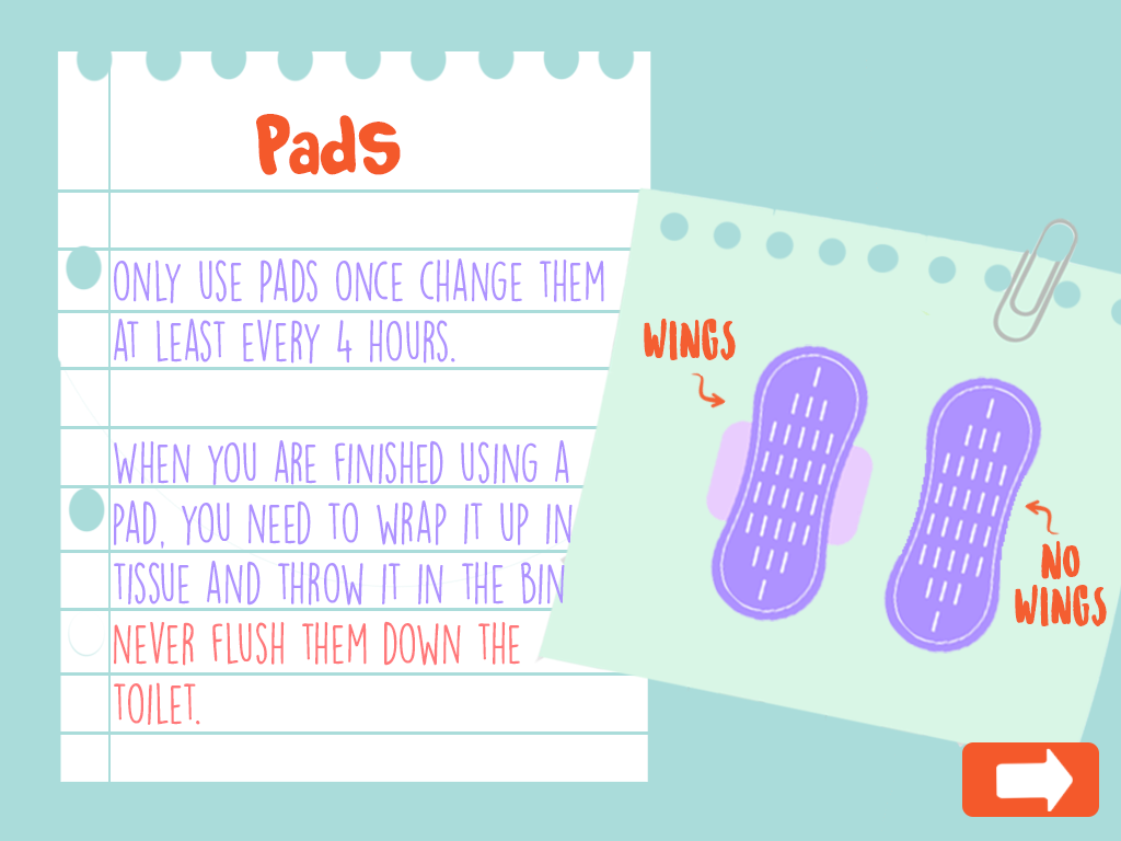
UI Design – Screen Renderings

Making the Screens

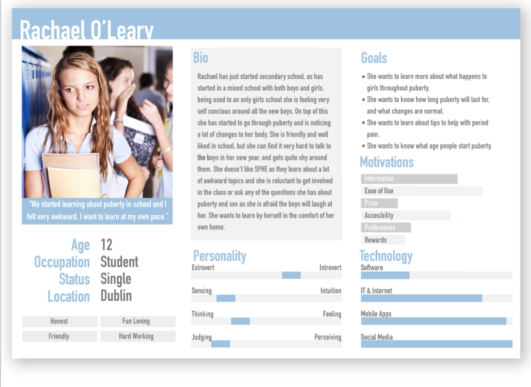
In order to bring the application fully into fruition it was necessary to create high resolution renderings of the final screens so as to guide the application development process carried out by other members. This began by working from the wireframes previously created based on the sitemap created earlier from the script provided. It was also necessary to develop visual elements interpreted from the script. These wireframes represented the structure of the application, the visual style of the application was represented in the screens created as part of this step in the project. The color scheme for the application was heavily influenced by the graphic design and other branding created for the project, variations of these colors were used to create a more extensive color scheme with which to work. A major aim in this stage of the project was to create a style for the application which encompasses both the visual style created for the characters and animations and the other graphic design elements created for this project.

Initial Screens

The first attempt at visually representing the UI of the project, although it was unsuccessful, did allow for the creation of a visual style that was carried onto the final screens. A problem that occurred with these initial screens was the metaphors behind the visual elements used. These visual elements included a ripped notebook page, which suggested that there was an element of shame and secrecy associated with the topics being discussed. These visual elements were intended to give the sense of a diary, but as they metaphor behind them wasn’t correct, it was decided that these should be redesigned.

Final Renderings

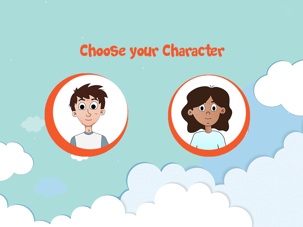
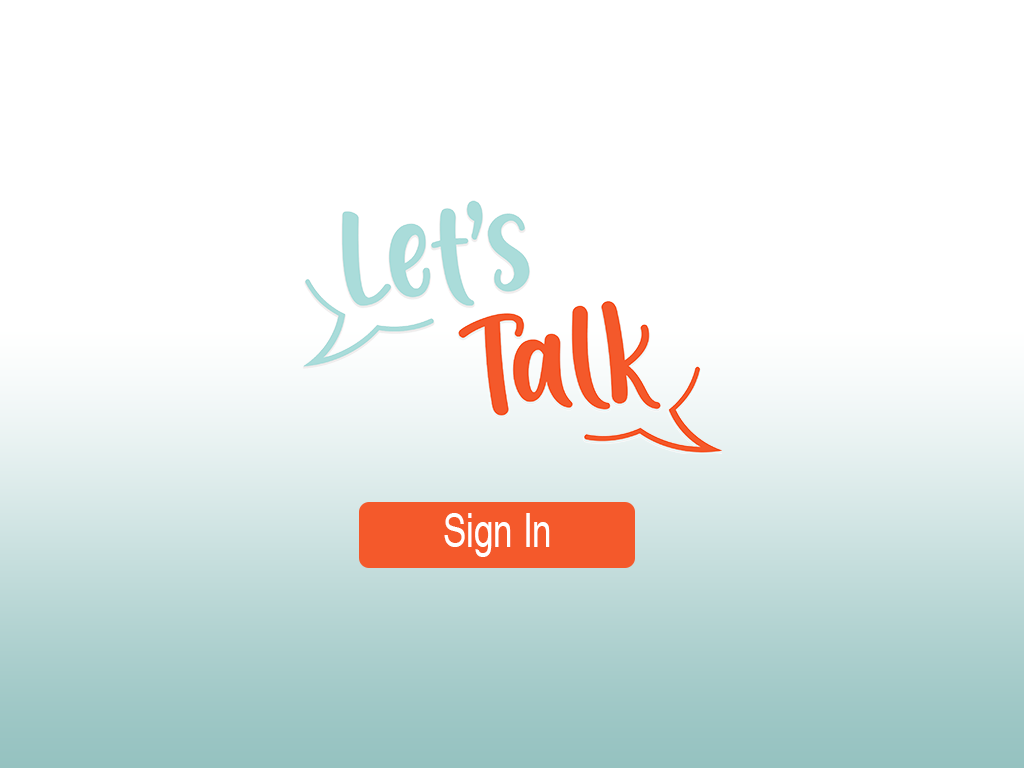
For the final screens it was decided that a book should be used at the visual style. This was to represent the journey associated with puberty, and the progression you will undergo both physically and emotionally during this time of your life. To facilitate the book aspect of the application a design was created that included forward, back, home, read and book buttons that allowed for the functionality of the book. For these a blue background with a deeper blue icon was used. For the screens themselves that were contained in these pages a background was created for each page, to add more interest to the screens. These patterned background added visual interest to the screen, especially as some of the screens were intended to be loaded blank and then have other elements appear after user interaction. The home page, rewards page and content unavailable page were created in a similar style to the poster, using the logo and the sky elements.

Preparing The Screens

As it was necessary for some of the elements included in the UI to be on seperate layers for the final application, it was important to correctly format the screens created so as to create a folder of assets that was easy to include directly into the application for the developer. This was done by exporting the individual layers included in each screen to separate pngs and organising them into clearly labelled folders. To ensure smooth teamwork and to make the already difficult task of application development easier it was necessary to properly organise the created assets so that other team members would easily be able to locate and access them. After these assets were correctly exported and labelled, it was necessary to upload them to a shared drive folder so as to ensure other group members would have proper access to them. A meeting was had with the application developer to discuss the functionality of each screen and explain how this is envisioned to be implemented. This ensured that the final application accurately represented the Ui that had been designed for this role within the project.The application developer and UI designer were in contact back and forth and other visual elements ended up being created upon request to allow for the developed functionality, these items included a parents manual download screen and a content not yet developed screen. The UI design can be seen in its final form at the following web address, using login demouser and password demouserpwd.

http://webdevcit.com/2018/Sem2/R00138548/letstalkfyp/index.html

Wireframes

Following the development of the sitemap it was important to create wireframes in order to represent the pages of the application that must be developed. Wireframes are essentially the bones of a website or application, they represent the visual aspects of the application devoid of any design elements. Emphasis is placed on layout and content placements, placing functionality to the forefront of the development process. As sitemaps can be difficult to visualize it is important to develop wireframes as they are the first visual process when developing a navigation, and allow you to focus on developing a successful user interface (UI).  They allow for the elimination of any unnecessary pages and allow for changes to the navigation before the development phase. “During a wireframe project, web designers have the chance to focus on user experience only – the factor that matters most to everything from conversion, to customer loyalty. Without the distraction of fonts, colours and imagery, wireframes can allow designers to work on the underlying elements of a website, and eliminate the need for expensive changes in the long-run.” ( McLoughlin, 2017)

Early variations of the wireframes were unsuccessful as they focused on design and details as opposed to functionality, which in turn led to the development of a prototype that was difficult to use. When redeveloping the wireframes focus was placed on functionality, referring back to personas and scenarios were quite beneficial when creating the wireframes. It is important to focus on usability during the wireframing process. Placement of content and functionality are the two key aspects when creating wireframes. Redeveloping the wireframes allowed for the application’s architecture to be restructured in order to develop a more successful navigation. “Wireframes allow you to map out the functionality of the pages, catch problems early, and save time on revisions later.” (Pronto, 2017)

Wireframes allow the focus to be placed on usability and functionality as opposed design. Wireframes bring clarity to a project and allowed for the development of content placement and the interactions of the application.

Initial Wireframes
Final Wireframes

References

McLoughlin A, (2017), 5 Key reasons why wireframing is important in web design, viewed 17/04/19 via <https://www.tone.co.uk/5-key-reasons-wireframing-important-web-design/>

Pronto.io, (2017), Why Wireframes Are Important in the Design Process. 17/04/19 via <https://medium.com/@protoio/why-wireframes-are-important-in-the-design-process-de4e773e611>

Sitemap

When developing the user interface (UI) for the project “Let’s Talk” it was vital to first outline the steps a user must take to get from point A to point B when using the application. In order to create a successful and user friendly interface it was important to first develop a sitemap for the project. A sitemap is a representation of the applications pages, created to help users navigate the application. It is a hierarchy of the pages organised that will allow for the clarification of the content that needs to be created for the application, while also allowing for the elimination of any unnecessary or duplicated pages before the development phase of the application. “Most sitemaps are arranged as a flowchart. Like laying a foundation for a house, a sitemap gives your team a base to build on. It lets the team decide how best to organize the sections and individual pages of the website.” (Kathy, 2019)

It was important to develop a sitemap for the application before the development and design phase as it helped clarify the application’s aim. Outlining the content and hierarchy of pages was beneficial in ensuring that all aspects of the application supported the aim of the application, to educate children safely on puberty and sexual education. It was also beneficial in eliminating any content that was not reinforcing the applications aim. In the development of the sitemaps duplication of content became apparent, which was leading to conflicting information being portrayed. Pages and content were either combined or adapted in order to create a more successful navigation. “Take this opportunity to eliminate any clutter that might confuse or distract your customers. Clearly identifying your website’s purpose will lead to a more effective site.” (Kathy, 2019).  Once the initial sitemaps were developed the next step was to create user flow diagrams in order to gauge how a user may use the site in order to eliminate any unnecessary steps that were excessive ot may lead to confusion. Developing the sitemaps for “Let’s Talk” were also beneficial in order to allow all team members to be on the same page in relation to both content creation and development of the application. In order to develop a successful UI the creation of a sitemap was necessary as it allowed for a clear and direct approach to developing the application “Let’s Talk”.

References

Kathy (2019), Why Create Sitemaps and Wireframes Before the Visual Design?, viewed 08/04/2019 via

< https://www.windmilldesign.com/sitemaps-wireframes >

Personas & Scenarios

“Personas are fictional characters, which you create based upon your research in order to represent the different user types that might use your service, product, site, or brand in a similar way. Creating personas will help you to understand your users’ needs, experiences, behaviours and goals.” ( Dam, Siang, 2019)

Personas are a vital aspect in the development phase of a user interface (UI) as user needs are at the forefront of the design decisions made when creating the interface. Persona’s outline the user’s goals and capabilities when using the application. Once personas are developed it is important to define scenarios in order to prioritize features of the application in the development phase. Persona and scenarios offer an inexpensive option when analysing the proposed UI.

By placing emphasis on the expectations of the user through the use of personas and scenarios optimal placement of content can be achieved which support the aim of the project. This allows for the development of a successful and user friendly UI. “Personas help product development teams arrive at design solutions that better address the needs and preferences of all audience segments. Personas offer insights that can lead to improved functionality and a better experience for both industrial design as well as interface design.” (Liquid Agency , 2014)

Initial research was carried out into the target audience and intended end user of “Let’s Talk” when developing the personas for the project. In depth research was carried out in order to collect as much knowledge possible about the intended end user to create an accurate representation of the user when developing personas for the application. Detailed descriptions of the end user were then developed. Following the development of the personas, scenarios were created in order to outline the possible solutions the application can provide by creating real life scenarios that feature the persona in the role of the user.

References

Liquid Agency (2014), Five Reasons why Personas Matter, viewed 01/04/2019 via <https://medium.com/brand-experience/five-reasons-why-personas-matter-54db192f38b6>
Rikke Dam, Teo Siang (2019), Personas – A simple introduction, viewed 01/04/2019 via <https://www.interaction-design.org/literature/article/personas-why-and-how-you-should-use-them>

Poster Design

When creating the poster that would represent the project “Let’s Talk” it was essential to outline the content that would be represented on the poster. This allowed for the headings and subheadings of the poster to be decided and allowed for the gathering of the essential information that would be put into each section. It was decided that there would be a brief description of the project and its goals, the research conducted about the topic, the problem we identified, the solution we created, and the future of the project. Once the content was decided it was essential to decided the presentation, or order of the content and how it would be displayed on the poster, the hierarchy of information.

  • Summary
  • Problem
  • Solution
  • Future
  • Research

A draft of the text that would be on the poster was then created, reworked and finalised.

Once the information was finalised the next step was to roughly sketch out various poster designs. That could represent the information accurately while also conveying the project aims, being cohesive with the branding guidelines of the project. The aim of the poster is to convey a positive and professional profile, while establishing “Let’s Talk” as a commercially viable product.  

Initial Sketches

Following the sketches once a design had been chosen the next step was choosing a colour palette with which to create the poster. Sticking with the branding and visual identity, the colour palette to represent the project was blue, yellow, orange and pink. Utilising this colour palette allowed for a consistent branding identity with both the application and the visual components associated with the application.

The final aspect of creating the poster for “Let’s Talk” was created a digitised version of the chosen design. Initially graphics were created to place on the poster. Utilizing the various colours in the colour palette allowed for the poster to be split into sections without creating defined borders. Overall the finished poster conveyed a professional and informational tone, but simultaneously stuck to the overall fun and happy tone of the project.

Branding

“Branding, by definition, is a marketing practice in which a company creates a name, symbol or design that is easily identifiable as belonging to the company.”  (Smithson, 2015)

Ahead of creating the visual identity for “Let’s Talk” I felt it was important to initially research the basics of branding to familiarize myself with common methods and practices in order to create a successful and cohesive brand for the project. It is important to create a visual identity that translates the project’s goals while simultaneously creating a professional, distinguishable and memorable impression on both clients and competitors. Graphics and visuals associated to the project will aim to work together and create a unique, cohesive and competent identity.  

Branding is an important aspect in the development of a product or business, there are many benefits to a strong visual identity.

  • A strongly established brand can help generate business and increase the value of the product or business. Recognising and outlining the business requirements of “Let’s Talk” were essential in creating a strong branding identity. Establishing the commercial viability of “Let’s Talk” is heavily reliant on a successful and strong branding identity.
  • A successful branding identity will establish a professional impression among clients and competitors, which will create business and opportunity for investment.
  • A well established brand inspires a professional tone and will be essential in inspiring trust with users and potential users of the application. A polished portrayal will insight more customers and will give the impression of expertise in the industry.
  • Successful branding allows for the creation of a cohesive and appealing advertising strategy that aligns with the project goals. “Advertising is another component to branding, and advertising strategies will directly reflect the brand and its desired portrayal.” (Smithson, 2015)

Brand Strategy is how, what, where, when and to whom you communicate and deliver your brand message. What you communicate visually and verbally, and where an how you do it are all important aspects of your brand strategy. It is vital to have  consistent and strategic branding. Successful branding adds value to the product or business. Evoking emotion and perceived quality are intrinsic to creating added value to a product.

When defining the branding identity of “Let’s Talk” it was important to consider various aspects of the project, such as, the goal of the project, target market and customer expectations, and the qualities associated with the project. It was essential to research the target market and become familiar with the expectations they have for an application like “Let’s Talk”. It was also essential to research the current competitors of the application to gauge the level of professionalism and gain further insight into how to reach customer expectations.

Creating a logo for let’s talk was an essential step in the development of the branding identity. When developing a logo for the project it was vital to keep the project aim an essential part of the logo, as it will be the visual that is most associated with the project. Creating an open and honest conversation about puberty and sex education is the main aim of the “Let’s Talk” and it was important to incorporate this into the logo design.

Initial Sketches were drawn up

Finalised initial logo design.

As the branding and project evolved it became apparent that the initial logo no longer represented the project in a successful way. So it was decided to revisit the logo and develop a new logo the portrayed a more professional tone.  A further two logos were designed and developed.

Before finalising with

REFERENCES

Smitson E, (2015) What Is Branding And Why Is It Important For Your Business?, viewed 21/03/2019 via <https://www.brandingmag.com/2015/10/14/what-is-branding-and-why-is-it-important-for-your-business/>

UX Competitor Analysis

DIRECT COMPETITOR (Story Book Formats)

LITTLE STORIES

The tone of the competitor

A happy and fun tone is being portrayed by this particular apps UX design. The use of bright colours and fun characters are helping create this tone. When you click into a story there is music in the background of the story to help set the tone of the particular story you were reading. For example I read a story about a young eagle who is afraid to fly, the music in the background was very calm and inspirational, which fit with the story perfectly and really helped set the tone.

All the graphics in the story were also full of fun characters and bright and lively colours, which will really help in capturing a child’s interest.

Good and bad features

Good features.

Features I really liked on this app, was their use of colour. They used bright and lively colours which really helps set the tone of the app itself, as well and engage a young audience.

I also really like the characters and various illustration designs used in the app itself, moving from story to story you see various styles of illustration, which in my opinion is a great idea as this will help keep the app interesting to children.

There is very little navigation in the app itself which I like, to turn pages you swipe and as well to look through books. You can also choose to go to any page you would like which I thought was an interesting feature of the app.

There is also an option to email the app company with comments within the app, which is only accessible by putting in a code which they ask to put in, this would stop them recieving nonsunual emails from young children, which I thought was a very clever idea.

They also provide you with a preview of each book which contains a short paragraph about the book along with some imagery from the book itself.

Arguably the best feature of this app is the fact that it includes the child in the story, once you enter the gender and name it then puts that name into the story. This is a fantastic feature to keep children interested in the app itself.

Bad features
The main thing I didn’t like about this app was there was a lot of in-app purchasing. They provide you with one book for free, and then if you want any more you must buy them.

I also felt the font itself was a bit small for reading for a child.

As well as swiping to turn the pages there are buttons that can be pressed, but they are almost invisible as they are so unnoticeable.

Another feature I didn’t like was there were a lot of different fonts, there seemed to be no consistent font throughout the app itself.

User Reviews

The app has 4.7 stars out of 5 on the Itunes app store, out of 41 ratings. With the lowest anyone giving the app being 3 stars out of 5.

Wait/load times

The wait and load times of the app were very short. Everything loaded quickly and when you went from page to page or book to book everything appeared quite quickly on screen.

Design

I really liked the overall design of the app itself. I thought there was a good use of colour used, and the way they introduced characters into the app was fantastic and would really appeal to children. Although there were a few navigation issues I came across overall I believe their design was quite successful in what it was trying to achieve, a fun and engaging app for young children. Even the design of each book and the transitions from homepage to book and page to page were all done very successfully. Buttons and Icons as well were all very clear and well designed.

BEDTIME STORY

The tone of the competitor

The tone of the app is a very boring and dull tone in my opinion. The use of very muted colours, little to no imagery and each story is very text heavy. The UX design of this app is very simple, with just a list of stories and when you click into the story you are provided with the audiobook and text of the story. The little graphics that are used seem to be images taken straight from the internet and there is no visual correlation between each story. That is why the design of the app sets a very disengaged tone.

Good and bad features

Good features

A good feature of this app is that there are a lot of stories on the app, you can read or listen to anything from fairytales to educational stories, they are also all free.

It is very easy to navigate through, everything is layed out simply.

The voice overs are very engaging and easy to listen to.

You can also listen to the stories without using the app, which is a great feature.

Bad Features

The UX design of the app is very poor. There is very little colour used throughout the app and it is quite boring to use.

There are a lot of ads in the app also.

Again there seems to be an inconsistent font type used throughout this app also and the font that is used is quite plain and boring.

The stories are very text heavy and I would not suggest using this for a child for reading  as they would not be able for all the text.

User review

The app has no reviews in the Itunes App store.

Wait/load times

There is not a lot of wait or load times, once you choose a story it is almost instantly playing and you can read the text. Going between sections and stories is also quite quick and easy.

Design

In my opinion the design of this particular app is quite poor. From using the app I believe there was a lot more thought put into the content rather than the overall look of the app. It is not unusable and the navigation is quite easy, but again the overall user experience is quite lacking with the overall look of the app being quite boring and lackluster.

Colour Theory

“Color theory encompasses a multitude of definitions, concepts and design applications – enough to fill several encyclopedias. However, there are three basic categories of color theory that are logical and useful : The color wheel, color harmony, and the context of how colors are used.”(Morton, n.d.)

Color theory is an important aspect when developing a user interface (UI) and creating a visual identity. Color theory refers to how colors logically work together, to create a story that both inspires enthusiasm and appeal in a user or viewer. Color is the most important aspect in design, it has the ability to set the tone of the design and evoke an emotional reaction from the user or viewer.  “Choosing the right colors and knowing why certain colors work and others do not can determine whether or not our design will work. Poor color choice can make our site difficult to use, or our text impossible to read and the user will leave our website.” (Trythall, 2015)

THE COLOR WHEEL

“A color wheel (also referred to as a color circle) is a visual representation of colors arranged according to their chromatic relationship. Begin a color wheel by positioning primary hues equidistant from one another, then create a bridge between primaries using secondary and tertiary colors.” (Worqx, n.d.)

The Primary colors are red, yellow and blue, all other colors are derived from these three colours. These three colours cannot be created from other colours.

The secondary colours are green, orange and purple and are created by mixing the primary colours.

The tertiary colors are yellow-orange, red-orange, red-purple, blue-purple, blue-green and yellow-green. These colors are created by mixing a primary and secondary colour. Depending on the primary colour that is used the hue of the tertiary colour could be different, hence the double barreled name.

COLOR HARMONY

“Harmony can be defined as a pleasing arrangement of parts, whether it be music, poetry, color, or even an ice cream sundae.” (Morton, n.d.)
When choosing a color palette it is vital to choose colors that work well together, you want to create a visual that is pleasing and exciting to look at, and choosing the correct colour pallete is an important step in this process. If you cannot create a harmonious color palette that can have a detrimental effect on your design as you are not only disengaging the viewer or user, but you will create a boring or chaotic visual.  Creating a chaotic visual will disencourage a user or viewer, as a busy visual will not allow for concentration. When developing a color pallette it is important to develop a color story that falls between busy and boring, as opposed to under stimulating or over stimulating a viewer.

COLOR FORMULAS

Analogous colors – these are any three colours that are side by side on the colour wheel. Usually on colour predominates.

Complementary colors – these are any two colors that are directly opposite each other on the colour wheel. These colours create a contrast and stability.

Nature – these are pre existing color schemes in which you can find in nature.

COLOR CONTEXT

Color context refers to how colors work in relation to other colors and shapes and is a complex factor when discussing color theory. Depending on the other colors used in a design colors can appear differently despite being the exact same.

“The relationship of values, saturations and the warmth or coolness of respective hues can cause noticeable differences in our perception of color.” (Morton, n.d.)

COLORS FOR KIDS

When developing a colour story for children it is vital you choose a bright and vibrant colour palette, more is more when in relation to design for children. You want to grab their attention and stimulate their minds to keep them attentive. Red, blue, yellow, green, purple and orange are all considered happy colours and are a popular choice when choosing a colour palette for children, as you can include all these colours and more in your design. When designing for kids you can have fun and break a few rules as it is all about stimulating and keeping their attention. Using lively and vivacious colours will allow for this.

It is important to portray a happy feeling as that is what kids want when using an app or website. So using bright and happy colours will help you achieve this feeling of joy and allow you to create a bold and bright world for children to explore.

LET’S TALK

When developing a colour pallette for “Let’s Talk” it was important to choose colours that not only worked well together but portrayed a positive feeling. Being conscious of the sensitivity around the applications content, it was important to choose colours that evoked a positive emotion, as the aim of the project is to shed any preconceived notions surrounding sexual health and dispel any taboo associated with the topic. Choosing bright and lively colours will create a bright and open world for the children to explore as they are educated on their transition from childhood to adulthood.

These colours were chosen as they work harmoniously together. As the application is intended to be used by all genders it was important to choose a colour palette that is gender neutral. The use of these bright colours will allow for engagement with the application, with the ability to retain a child’s attention.

REFERENCES

Morton Jill, (n.d.) Basic Color Theory, accessed 08/03/2019 via

<  https://www.colormatters.com/color-and-design/basic-color-theory >

Trythall Joni (2015) Web Design for Kids : Color, accessed 08/03/2019 via

< https://webdesign.tutsplus.com/tutorials/web-design-for-kids-color–cms-24378 >

Worqx, (n.d.) Color Wheel, accessed 08/03/2019 via

<http://www.worqx.com/color/color_wheel.htm>

Designing UX for kids

“User interface (UI) design is the process of making interfaces in software or computerized devices with a focus on looks or style. Designers aim to create designs users will find easy to use and pleasurable.” (Interaction Design Foundation, n.d.)

When developing a User Interface (UI) it is important to utilize predictability, such as, a home button brings you to the home page. Creating a simple and sleek interface allows for an invisible feel for a user, every element must play a purpose. Which in turn, minimises the amount of tasks for a user to complete, which is in an important aspect of UI, creating a navigation that allows a user to get from point A to point B in as swiftly as possible. Assessment is a vital aspect of UI, offering feedback throughout to the user. Recurring design patterns throughout allow the user to become familiar with the interface, which enhances usability of the UI.

It is important to first identify the methods and rationale when developing a UI for children, as the target market for “Let’s Talk” is children aged between the ages of 8-13. Although the same outcome is expected from all UI design, it is vital to outline the key differences when approaching a UI for a certain age group, in this instance, children.

Initially I decided it was important to research creating a navigation for children. The navigation must be straightforward, it is important to develop a navigation that is coherent for children. Utilizing predictability when developing a UI for children is essential, buttons must also be large and distinct, 2cm by 2cm is the suggested dimensions. As “Children’s motor skills are still developing” (Drimteam, n.d.)  gestures that support their current knowledge of modern IT is suggested. Actions like swiping, tapping and dragging should be emphasised when developing interactions, as these movements are familiar and obvious for a younger user. Big arm and hand gestures are better developed during childhood. Tapping and swiping when interacting with the application is a strong approach when supporting a child’s motor skills. Easing interactions and minimising the navigation is another method when developing an engaging and enjoyable UI for children

Offering feedback and conducting assessments throughout the application is a vital aspect when developing an engaging UI for children. “Youngsters love being congratulated for their accomplishments, especially by characters that they can identify with. Humour them!” (Drimteam, n.d.). Utilizing praise in the application will instill both excitement and confidence in the user, which in turn will encourage the user, allowing them to ultimately grasp such a sensitive topic such as puberty. Educational applications are educating children in innovative ways, which were previously unimaginable.

It is important to consider that children have a lower attention span when creating a UI that both excites and engages them. The use of progression bars, and a fast load time when navigating through the application are beneficial. Kids are curious and will not necessarily use the app as intended, another detail which must be considered. Precautions must be in place to ensure that when a child does decide to stray away from the set navigation that the applications is still usable and any unpredictable steps taken will not take away from the set navigation and are easily corrected.

It is vital to design for a specific age range when developing a UI for children. There are vast differences in the capabilities of children which are just a few years apart. As well as their abilities, there is a sharp contrast between their interests, especially in relation to technology. Considering this, it important to design for a specific age range as it is rare that you will have the ability to design and interface that will appeal to children across all ages. When developing the UI for “Let’s Talk” it will be important to create an interface that appeals to children between the ages of 8 and 13.

In conclusion when developing a UI for children, it is important to take their physical ability, existing knowledge and motor skills, and most importantly their age into consideration. Creating a UI that exceeds a child’s knowledge and skills will discourage the user, which will result in a lack of confidence in the device and the topic.

References

The Drimteam. (n.d.). 10 Golden Rules of Interface Design for Children, viewed 22/02/2019 via
<https://www.drimlike.com/en/blog/10-golden-rules-of-interface-design-for.html>
Interaction Design Foundation. (n.d.) What is User Interface (UI) Design?, viewed 22/02/2019 via
<https://www.interaction-design.org/literature/topics/ui-design>

UX Requirements – Let’s Talk

It is important to first outline and identify the user experience (UX) requirements of “Let’s Talk” before advancing to developing the visual identity. This is a vital step because recognising and identifying the needs and objectives of the project will allow for the development of a good UX strategy and brand identity. When identifying the UX requirements of the application I will discuss the business, user and system requirements, which all have varying levels of importance, of the project. Understanding and establishing these three factors will allow for the creation of an effective solution in relation the the UX design.

Firstly, consider the business requirements, which are the most important when developing the UX of the application. Business requirements give clarity on the project’s objectives. They outline the project’s benefits, to both the developers and expected end user. This project’s intention is to create a safe and informational approach to educating children on sex and puberty, while encouraging an honest and open discussion at home. The developing team intend to address the lack of resources for educating children on puberty and sex by developing an e-learning application tailored to providing sexual health education to pubescent and prepubescent individuals. The ultimate goal of the application is to reach a standard, which demonstrates that with proper funding the application would be a commercially viable endeavour. “the business requirements should be discovered, understood and clearly defined for the project to be a success.” (Robin, 2018)

User requirements follow the business requirements in importance. User requirements document their needs and what they are intended to do when interacting with the system. One of the main user requirements of this project is the ability to use the application as an informational tool when learning or discussing the topic of sexual and health and puberty. In depth user requirements are necessary when developing a successful UX.

Finally the system requirements refer to expected functionality that the application developer will use to build the system. These requirements specify what the application will capable of. System requirements can be split into two separate headings.

  • Functional requirements
  • Non-functional requirements

Functional Requirements

Functional requirements refer to the how the system will perform. These requirements specify the expectations of the application, but not how there requirements will be delivered. Examples of the functional requirements of the application “Let’s Talk” include:

  • The ability to retain the users information.
  • Users must be assessed on the information being provided by the application.
  • Clicking a title on the diary page directs you to that chapter.
  • Clicking the book icon opens or closes the page on screen.
  • Tapping the background graphics animate an element on screen.

Non-Functional Requirements

Non-functional requirements refer to the remaining requirements. They specify standard that assess the functionality of the application. Examples of the non-functional requirements of the application “Let’s Talk” include:

  • The performance of the application for example load times.
  • Usability.
  • Security.
  • Capacity.

The system requirements are one of the most vital components when developing a successful UX. System requirements place functionality to the forefront to ensure that the UX meets the user’s expectations of the application